

Creating the brand for Typeform’s second product: an asynchronous video interaction tool.
-
We created a minimal brand identity that puts the focus on the VideoAsk brand core element: people’s faces.
-
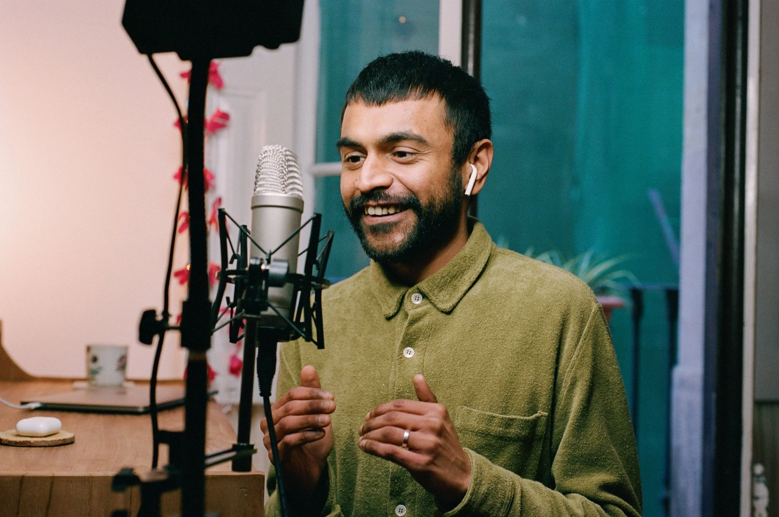
To encourage users to record themselves, we took a realistic approach in our art direction. We photographed team members in their real spaces with analog photography.
VideoAsk is an asynchronous video interaction tool launched in November 2019 by Typeform.
How can we make forms more personal? Make them feel like a face-to-face conversation.
GOAL
Create a visual identity to introduce the brand and communicate the product, without alienating Typeform customers.

Challenge
The product was in its MVP stage
VideoAsk was initially developed with continuous community feedback. We didn’t want to alienate or confuse Typeform users by launching videoAsk as a new Typeform product before validating it.
Additionally, we didn’t have enough data on how the product was going to be used, or who was our ideal customer profile.
It was an entirely new category.
When VideoAsk came out, there was nothing similar on the market. There wasn’t a blueprint or previous case we could build off.

Interviews with customers were very insightful
“I’m able to see or hear my clients and gives me a deeper insight into what’s going on”
— Ramonica
“Online courses need the human interaction, I needed a video form to collect answers.”
— Natalia
“I want to automate as much as I can. With video it’s nice, people like to see the face behind a company.”
— Kia
“Chatbots work well, but an equivalent to that on video is way more engaging.”
— Nigel
Key insight
It’s not about video, it’s about faces.

We selected Favorit, by Dinamo, as the main typeface.

Extreme text compositions are a big part of the identity, playing with type size and expressive layouts.

Bright colors and rounded shapes, add a friendly touch to the design’s rational approach.

Colorful elements break the rational approach on layout
Inspired by museum websites and art gallery brands, we created a brutalist visual identity with playful accents.
The minimalist approach puts the spotlight on people’s faces, which became our brand’s core element.
Big emphasis on a rational typeface in an expressive grid, which is uncommon on tech products, contrasted by very bright colors, and over-exaggerated rounded corners.
We think of it as a modern spin on rational Swiss design.
Key insight
Relatability and diverse representation were key to the brand’s success.

For the art direction, we needed the brand to represent relatable, realistic, diverse people.
We photographed our team members instead of models to show real people, especially showing diversity in gender, ethnicities, skin tones, queerness, and socioeconomic status.
To give a more personal feel, we used analog film to give the images a more spontaneous and natural look. It also differentiates VideoAsk from other tech brands, which tend to over-produce and refine their visual imaginary.

Results
VideoAsk got associated with the right keywords: interactive, human, personal.
10 months after launching the brand, we run a brand perception survey. These words scored higher for VideoAsk than they did for Typeform. The brand strategy had landed.
Higher brand passion score than Typeform
On the brand perception survey, VideoAsk scored 5.7, higher than Typeform (5.6).
Got a question?
Cool! Let’s connect ✨
Project credits
Ennio Dybeli
Design Lead
-
Paul Campillo
Messaging
Typeform
Tiago Almança
Photography
Typeform
Dimitra Papastathi
Sr Designer
Typeform