
Rebranding the emerging EdTech platform for music producers to scale and seduce the American music industry.
-
Through interviews and workshops with students, industry stakeholders, and the Aulart team, we established the company’s brand foundations for the first time.
-
To attract international talent and American investment, we created a visual identity that elevates the brand perception and expresses the company’s ethos and aspirations.
-
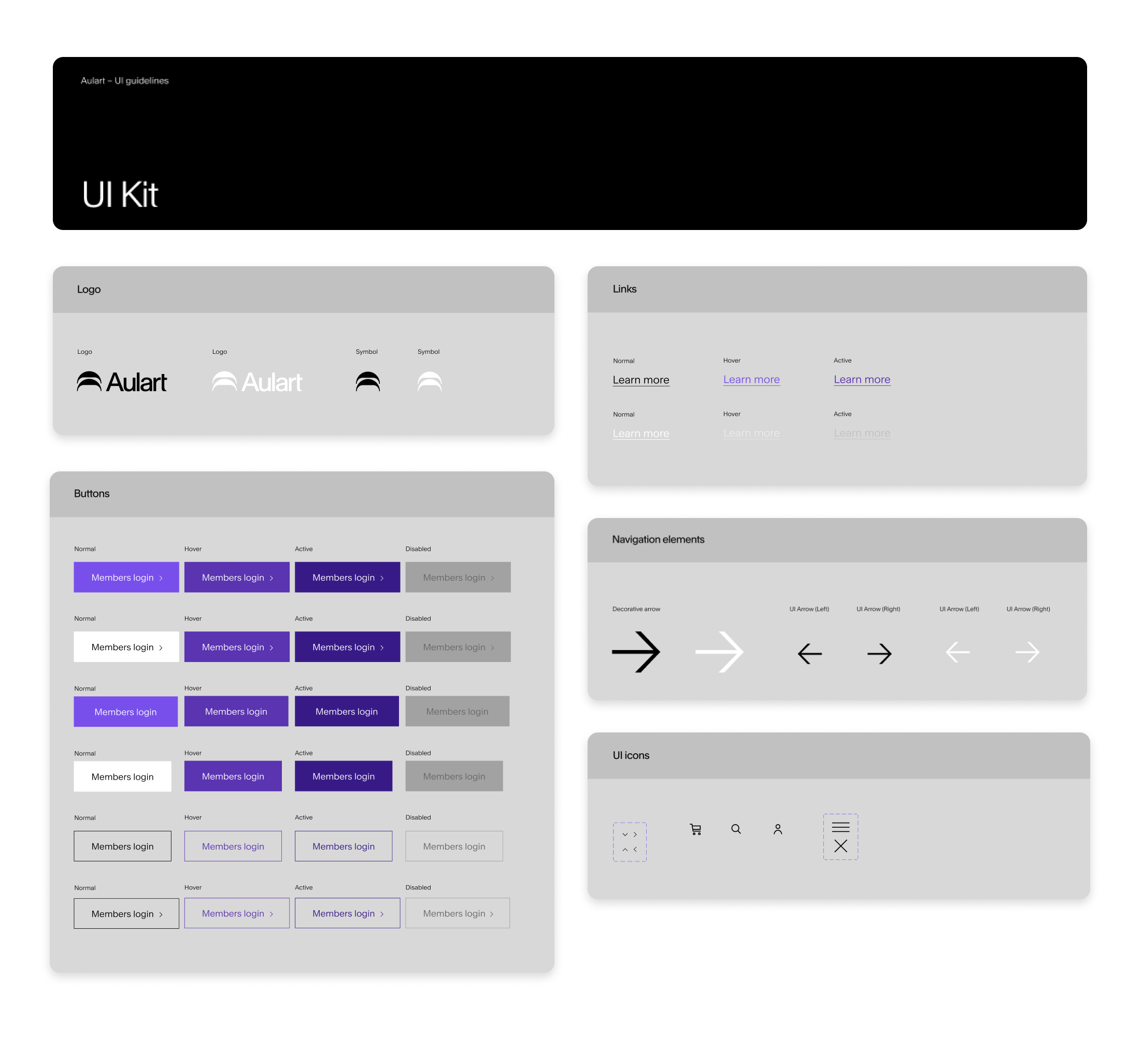
A visual identity is worthless if it can’t scale.
We created a UI tool kit and modular page builder to enable the team to express our brand at scale in meaningful ways.
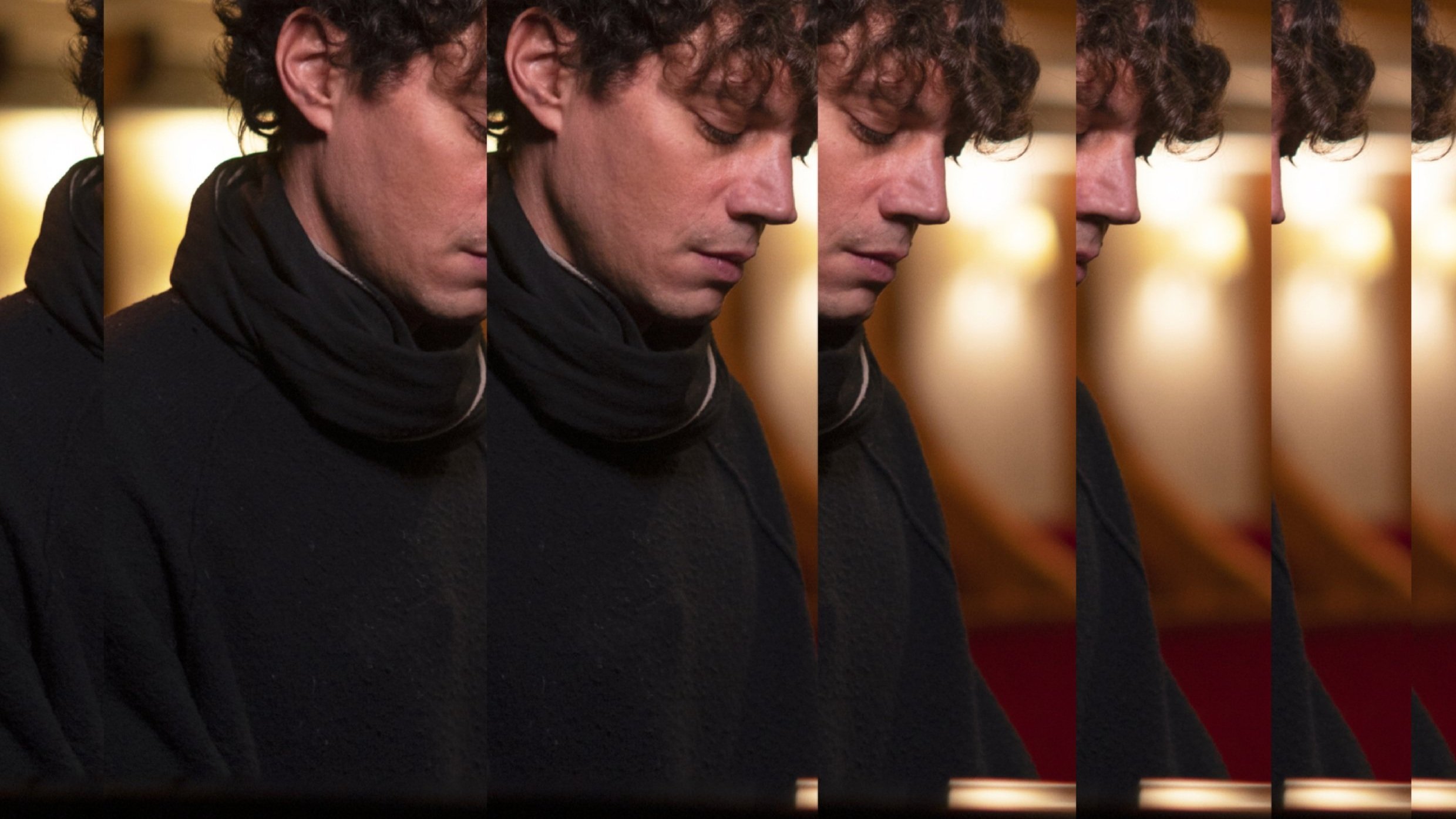
Aulart is an educational platform for aspiring electronic music producers, creating access to global artists through online bootcamps and masterclasses.
GOAL
The company had grown fast over 2021, securing first-class global music producers as instructors and raising a $1M first seed round of investment to expand its business in the US, and attract investors for a future series A.
We needed to create a brand that lived up to the expectations.

Challenge
The company was struggling to attract key talent
Some international artists and their managers were skeptical to associate their brand with Aulart’s brand.
The brand was not inclusive.
Previous brand assets had been created only by white straight males, and it was attracting mostly that same audience within a very specific music genre.
The team lacked the tools and systems to scale brand design
Every asset was created from scratch. No templates, design guidelines, or other tools to streamline the process. The creative process was undefined, and the output was often inconsistent.


We gathered insights from users, artists, industry stakeholders and the team.


Key insight
The gap between well-known artists and aspiring producers needed to be reduced to make the product relatable and engaging.
Repetition is at the core of electronic music, and also any learning process. Play, variate, repeat.
In partnership with Kurppa Hosk we created a visual identity that represented Aulart’s brand ethos and personality.
We anchored the visual expression of the brand on the idea of “repetition”, and created graphic elements to be used in different intensities to adapt the brand expression to any context.
Key insight
A visual identity based on a typeface and with an editorial approach can present diverse talent and become a key differentiator.


We delivered a flexible identity that expands across multiple mediums.


We created a design system that enables the team to express the brand at scale efficiently.

Results
4 deals with Grammy awarded producers and managers in the US.
Scott Storch, Steve Lobel, Che Pope… they all signed contracts with Aulart and are releasing products with the company under the new brand.
3x Conversion rate on ads
The new approach focused on relatability generated 3x more clicks on their ads. Users are more compelled to connect with artists if they see them as an equal.
Got a question?
Drop the fire 🔥

Project credits
Fredrik Camen
Client Director
Kurpa Hosk
Denis Kovac
Design Lead
Kurpa Hosk
Max Khomenko
Principal Designer
Kurppa Hosk
Ben Appleton
Film Lead
Aulart