

Positioning the popular online form platform as the people-first alternative, to compete with the established players in the market.
-
We captured the brand’s unique positioning around user experience with the brand proposition “really know people”.
-
We created a visual identity to represent the balance between rational and emotional, data and people.
Typeform is the popular people-first form builder, but it has not always been this way.
GOAL
Back in 2017, The spirit of the product and the ethos of the brand were pretty clear internally. However, the brand did not reflect those values.
After the company raised its first 15M series A, we felt it was time to communicate the world what the brand was about.
Take a sneak peek at the process
We documented the entire process of how our brand proposition evolved from “Make things more human” to “Really know people”.

Challenge
The brand lacked a clear direction
Typeform’s identity was a Frankenstein of values and feelings we’d accumulated along the way. It contained lots of good ideas, but it never had a strategy behind it.
Rapid growth positioned Typeform to compete against established players
After raising 15M, Typeform needed to define a clear positioning to be able to grow and secure its space in the market.
This is where we started

Stakeholder interviews
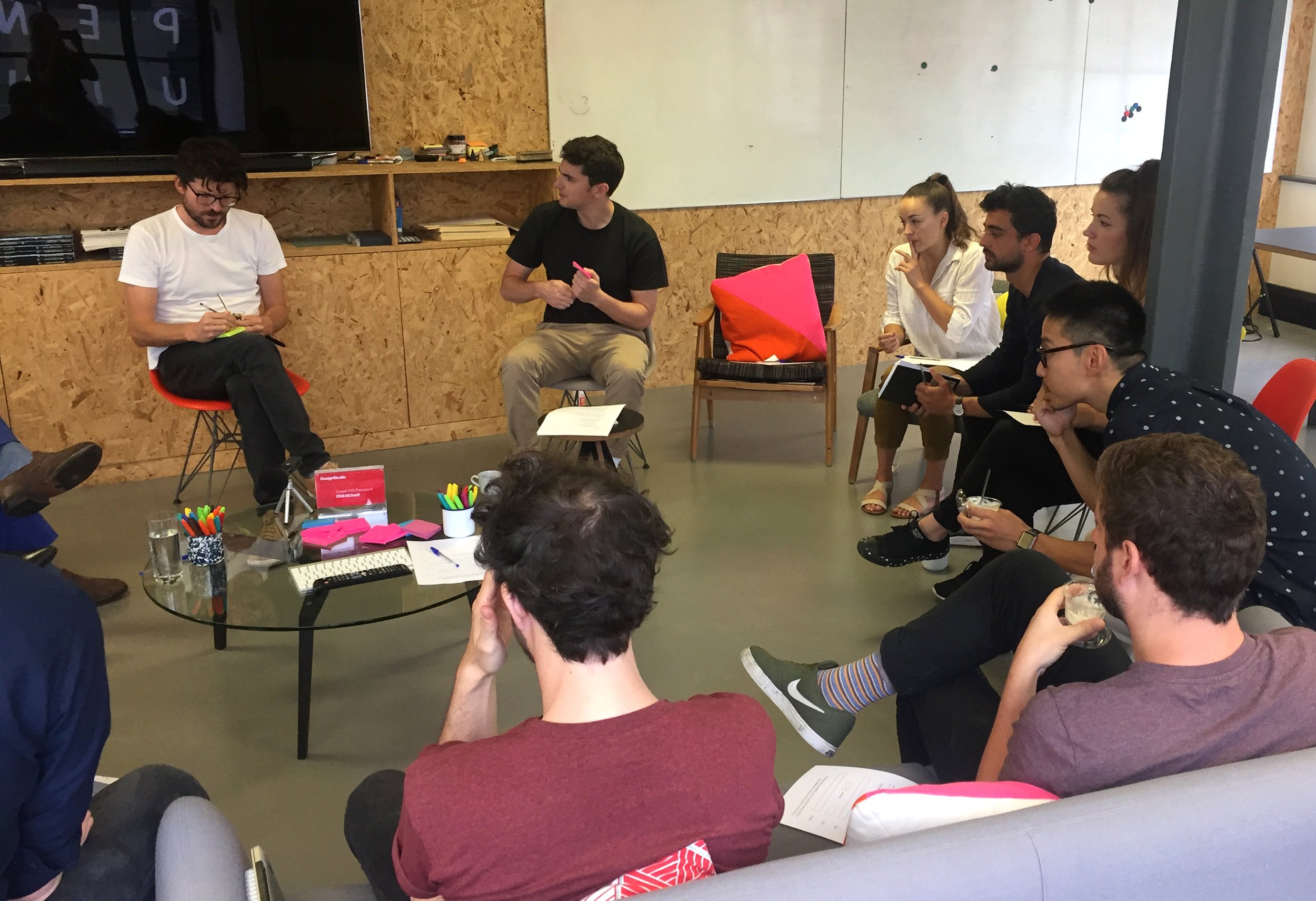
Focus groups with customers
With interviews, focus groups, and workshops, we distilled how the brand was being perceived at the moment, and the potential it had for the future.
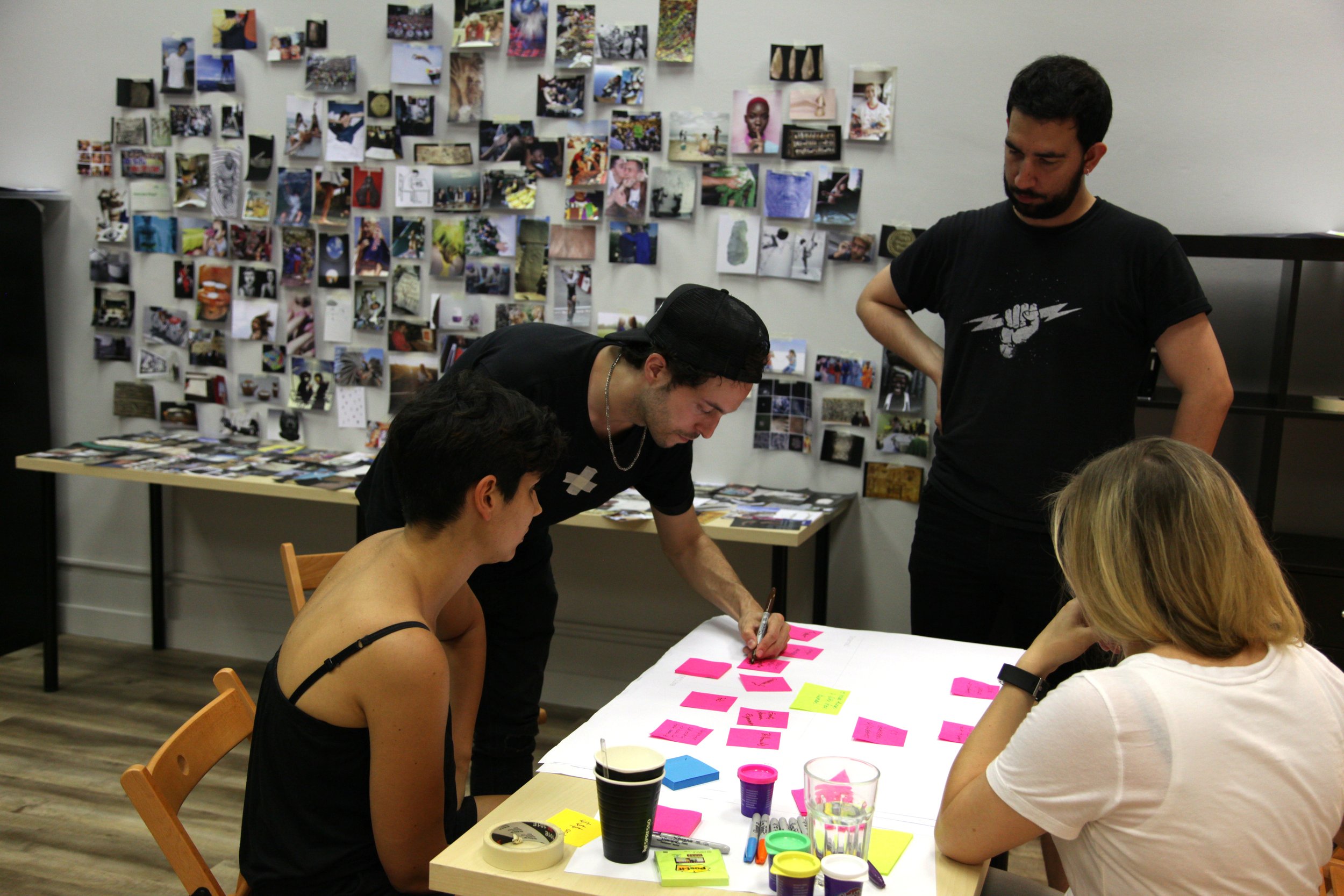
Workshops with the team
By listening to our team and customers, we realized that people often refer to Typeform with words like “love, fun, beautiful.” That’s some pretty emotional vocab for a data collection tool.
Key insight
Our users come to Typeform for the experience, not the data.
Key insight
Typeform’s secret sauce has always been a balanced mix of the rational and the emotional: data collection + conversation.

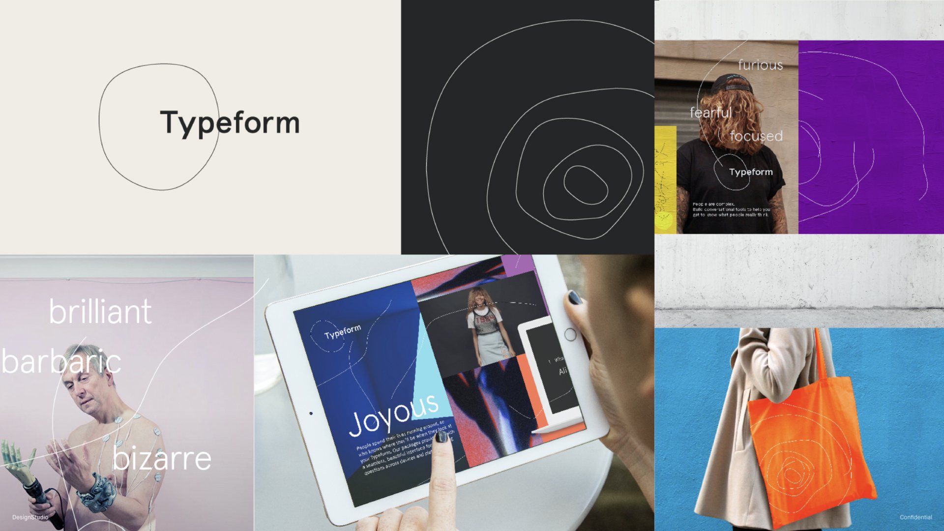
The brand took inspiration from nature

Those concentric rings could be seen as straight lines from another perspective.

The evolving ring became the core element of the brand.

The art direction relied on collage bring the brand to life.
Together with our design partners, DesignStudio, we came up with the idea of rings.
I asked different people around the company what the rings made them think about. I got everything from tree rings, to topographic lines, to the Zen Ensō Circle. This blend of artistic and scientific associations showed that the rings could be interpreted in both a rational and emotional way. It seemed like a powerful contrast.
Product videos have a less expressive, more focused approach.


Got a question?
Can’t want to hear it 🤗
Project credits
James Hurst
Design Principal
DesignStudio
Alex Johns
Design Director
DesignStudio
Paul Campillo
Head of Brand
Typeform
Adria Cruz
Design Operations
Typeform